
ImpactECS In-Depth: Leveraging Dashboards
Dashboards are ways to share performance and results at a glance. In ImpactECS, model builders can create visually compelling and interactive reports that can combine key performance metrics from multiple data sources with ImpactECS Dashboards.
Analysts can easily monitor results by product groups, departments or customers, and executives can gain corporate-wide visibility into cost and profitability performance. And both analysts and executives can drill-down into the details from any dashboard to get to the root cause of any ImpactECS dashboard result.
This article highlights the core concepts to consider when building ImpactECS Dashboards – data, visualizations, and interactivity.
Data
The primary consideration when building any ImpactECS Dashboard is determining the what data is required and where it’s stored. Dashboards can use any ImpactECS Item type as a data source, but Queries are primarily used to supply information. There are several reasons why Queries work best, including their ability to combine data from multiple places (in a single item) and to easily transform data into the required formats that support visualizations.
Visualizations
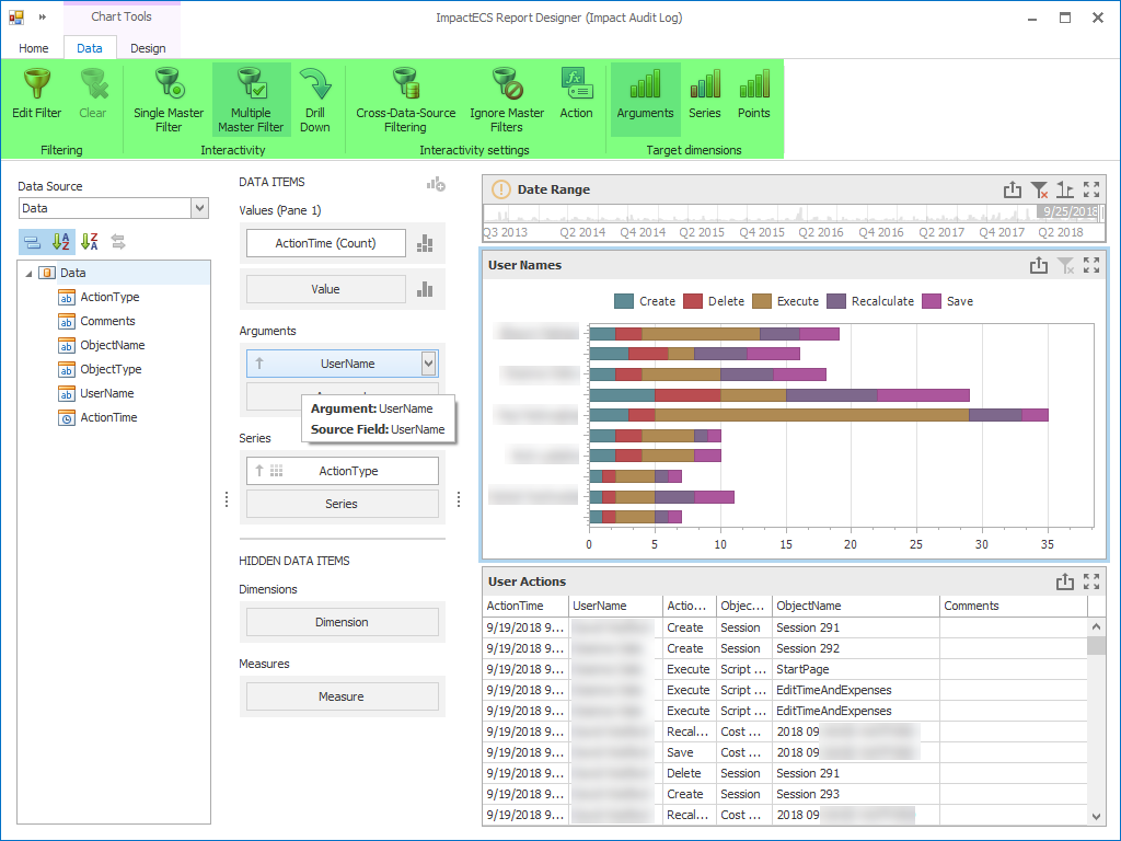
The ImpactECS Dashboard builder offers an extensive set of data visualization controls including charts, gauges, cards, pivot tables and filters. By selecting controls that focus on the key results and data, dashboard users can engage with model results in meaningful way to identify trends, outliers, exceptions, and opportunities.
Adding visualization controls to the ImpactECS Dashboard Designer is simple. First, drag the visualization controls onto the design canvas. Then drag the data source items onto the control on the configuration panel to connect the data source.
Interactivity
Unlike charts in traditional reports, ImpactECS Dashboards allow the users to interact with the underlying data that is visualized. Here are three ways that users interact with ImpactECS Dashboards:
- Filters. Filters allow users to select items in a visualization control and use this selection to automatically filter related controls. For example, displaying product cost results for a specific manufacturing location.
- Drill-Downs. Users can change the level of detail displayed in a visualization control with a simple click. For example, clicking an annual number to show the quarterly result, and clicking again to show to monthly result.
- Custom Actions. Model builders can define custom actions that are triggered when the user double-clicks a control, including executing a script or opening an ImpactECS Item.
Examples of ImpactECS Dashboards
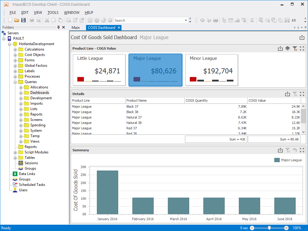
Cost of Goods Sold
This example provides a quick view of COGS performance using the cards to show total COGS by market segment along with a grid showing COGS detail by individual products and a chart of monthly COGS performance. Because the Major League card is selected and a filter is attached to the control, note that the other visualizations are filtered to show that market segment.
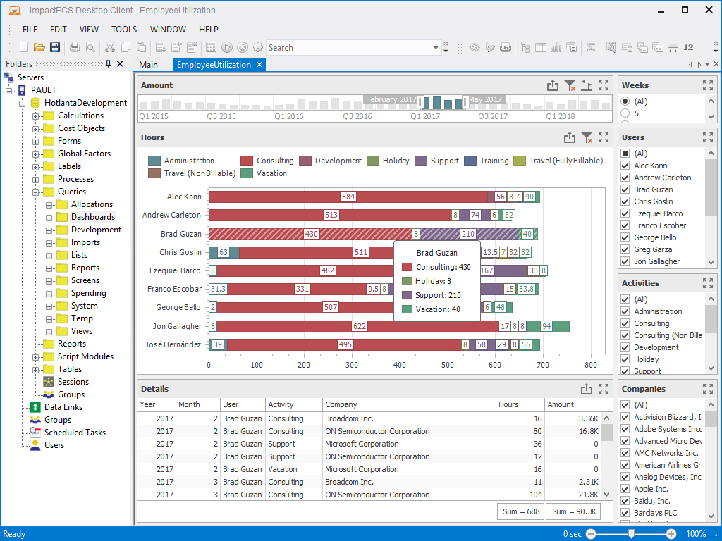
Employee Utilization
Dashboards can help expose utilization performance, with this example highlighting how a consulting team spends their time by rep and activities. By including filtering controls, dashboard users can use the dashboard as a control panel to simply adjust the displayed results.
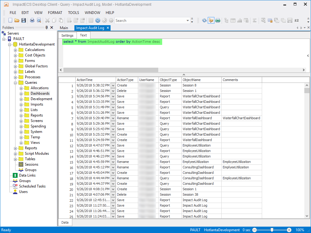
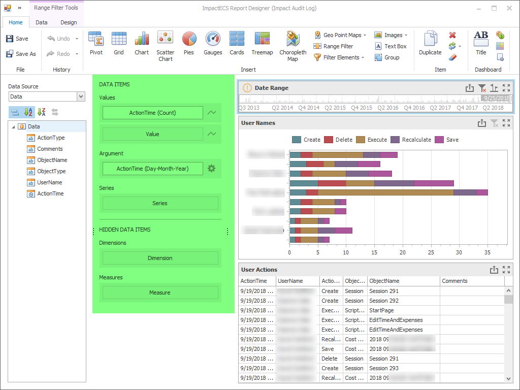
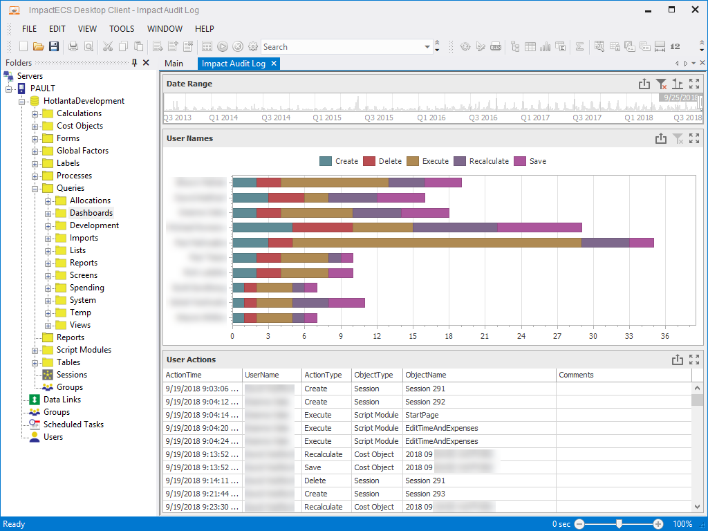
ImpactECS Audit Log
Looking for a way to quickly see how users are interacting with ImpactECS models? This audit log dashboard makes it easy to see which users are most active in the model and the activities that are most prevalent.
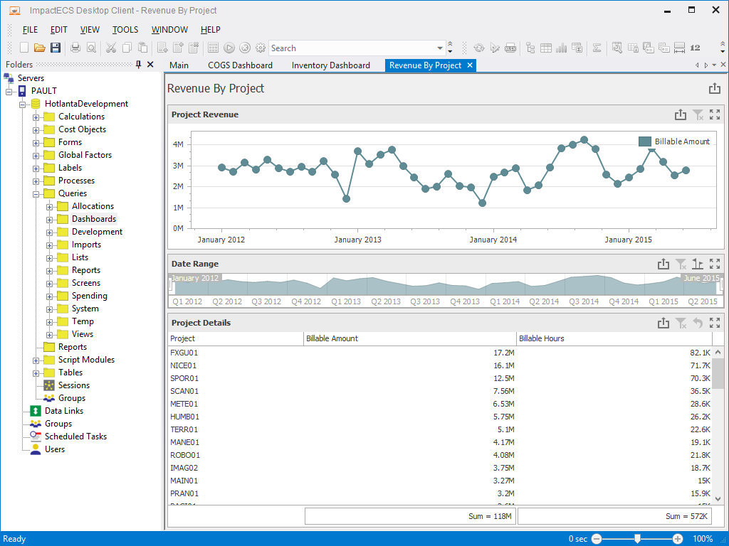
Project Dashboard
Keep track of billable hours by project and monthly billing levels with a project dashboard.
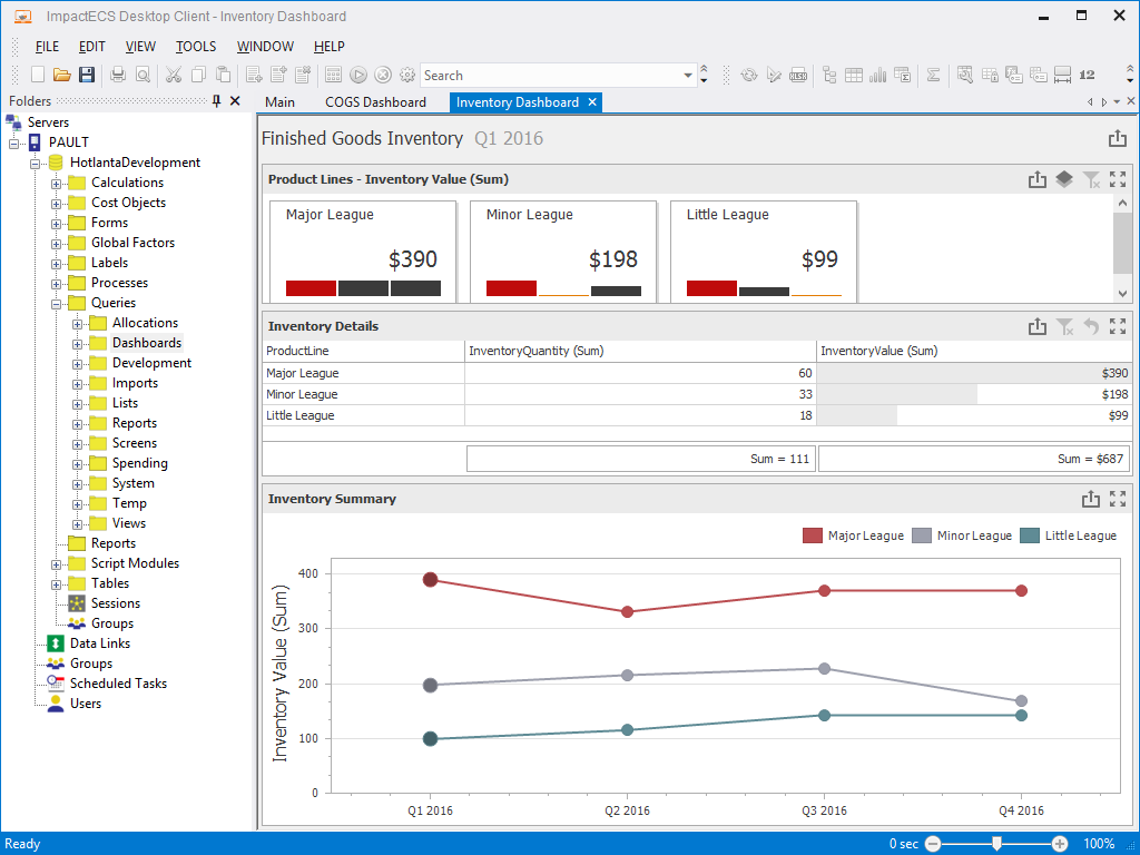
Inventory Dashboard
View a snapshot of inventory by product category and period along with a comparison of inventory values across channels.
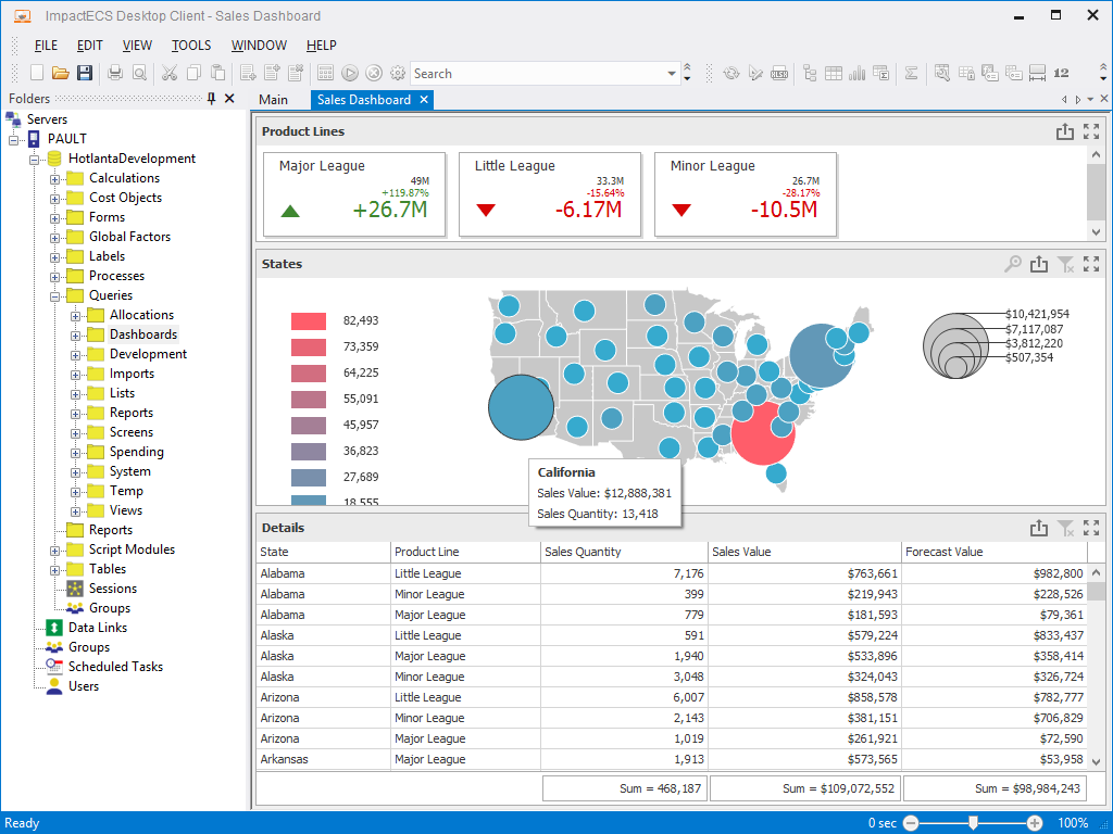
Sales Dashboard
Use maps to show performance by region. Dashboard users can hover over controls to display the detailed information that powers the visualization.
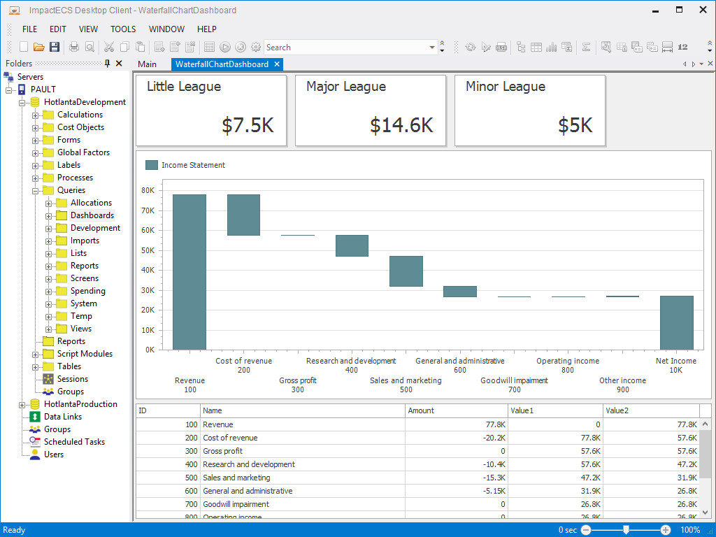
Waterfalls
Display the cumulative effects of activities with a waterfall chart dashboards. (Read our ImpactECS In-Depth blog post on Waterfall Charts for P&L Statements.)
Dashboards are a versatile tool included with every ImpactECS installation, so get on the visualization bandwagon and help your data and results tell a story. By linking data, visuals, and interactivity, dashboard users from executives to analysts in your company can quickly gain insights on performance at every level. If you have questions on getting started with dashboards in ImpactECS, email our support team and we’re happy to help out!